Improving the Offering Package Experience to Drive an 36% SQLs Increase in Just Two Weeks
My Role
Senior UX Designer
Team
Designer, UX Writer, PM, Sales
Timeline
3 weeks (Q2 2025)
Focus
User Experience, Interface, Readability
Summary & Impact
KitaLulus, Indonesia’s leading job platform with over 11 million job seekers and 100,000 companies, was facing a performance decline in Q2 — the number of SQLs dropped by 8.99% compared to Q1.
Since these metrics were directly tied to company revenue, the issue required immediate attention.
After implementing improvements to the Offering Package experience near the end of Q3, we observed significant growth within just two weeks:
- SQLs increased by 36.36%
- Conversion Rate improved by 18.73%
These results validated the impact of the design enhancement and highlighted the importance of optimizing user experience for business outcomes.
Background & Context
Low SQL Number
Based on performance tracking during the first half of the year, I identified an 8.99% decrease in SQLs (from 556 in Q1 to 506 in Q2). This decline indicated the need for immediate improvements to boost these numbers in the following quarter.
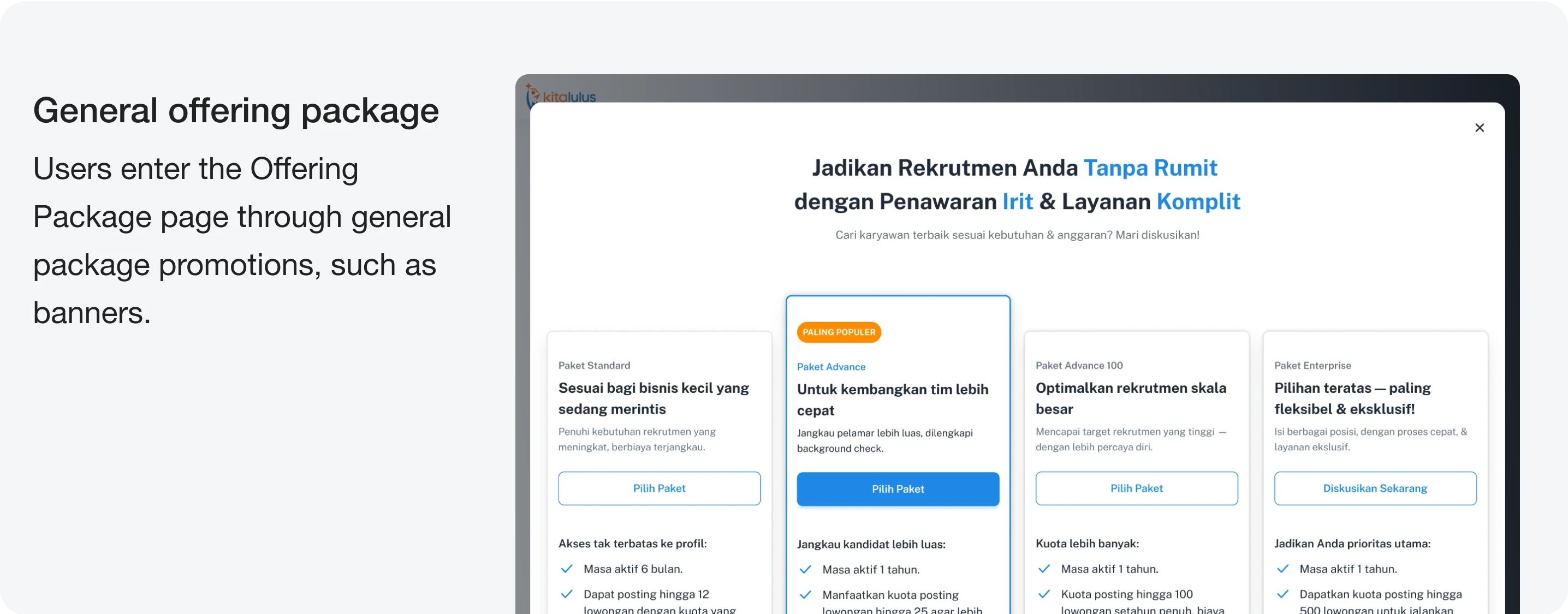
Research
Low Performance of the Current Offering Package
After a deeper analysis, I identified several issues in the current Offering Package page. Below are the key findings and explanations.
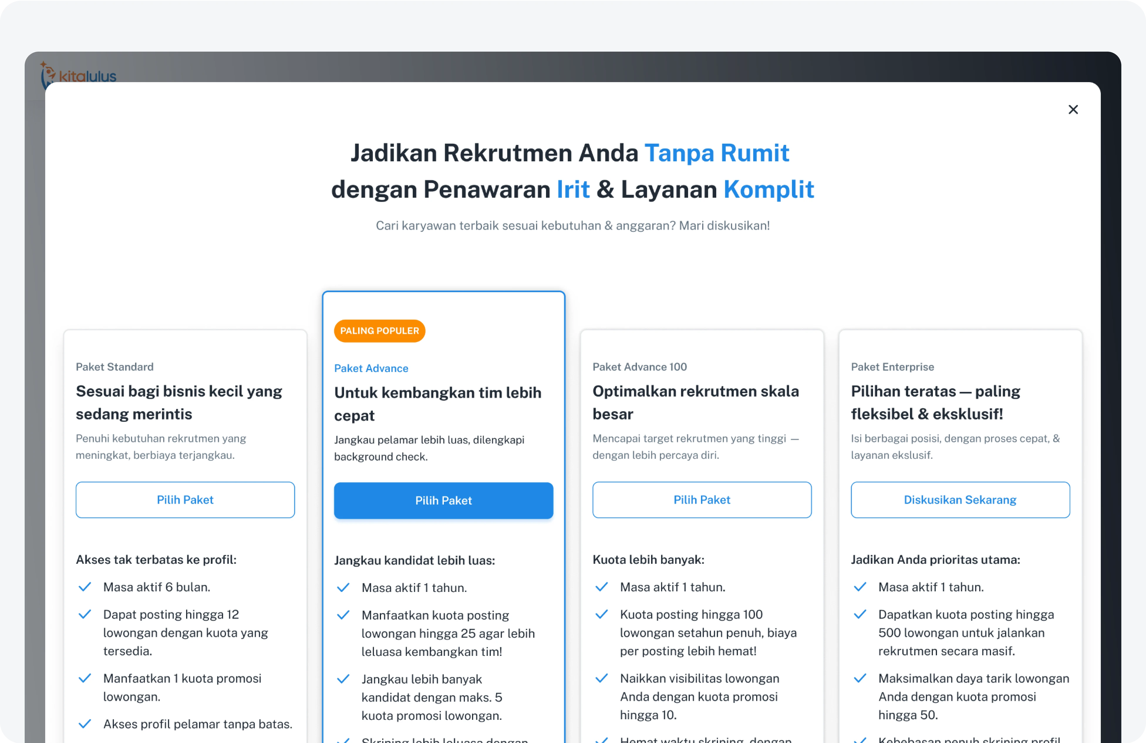
Problem #1
Lacks storytelling and emotional framing
The text is too descriptive and technical. It doesn’t include emotional or motivational elements that answer the question, “What’s in it for me?”.
Problem #2
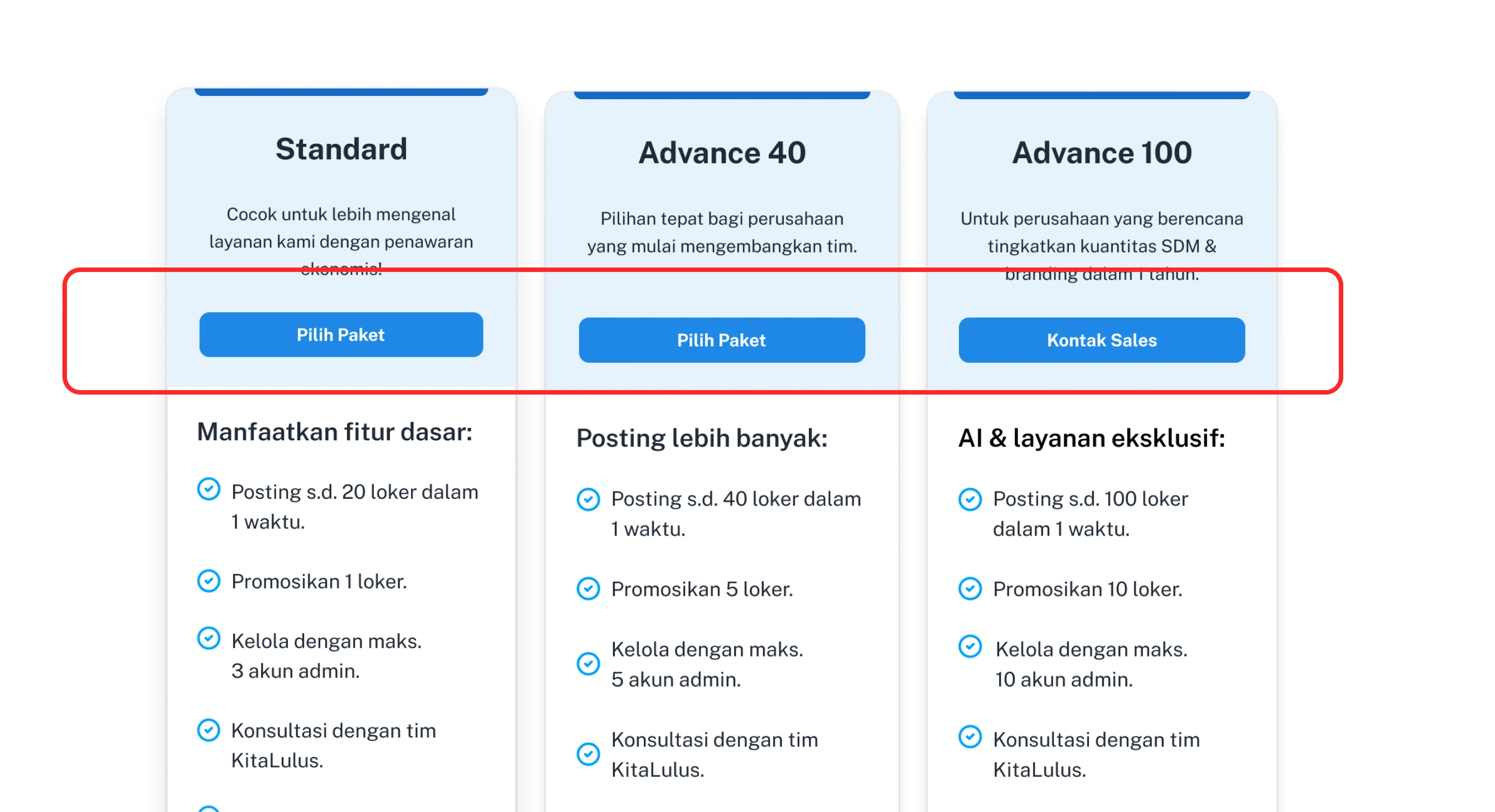
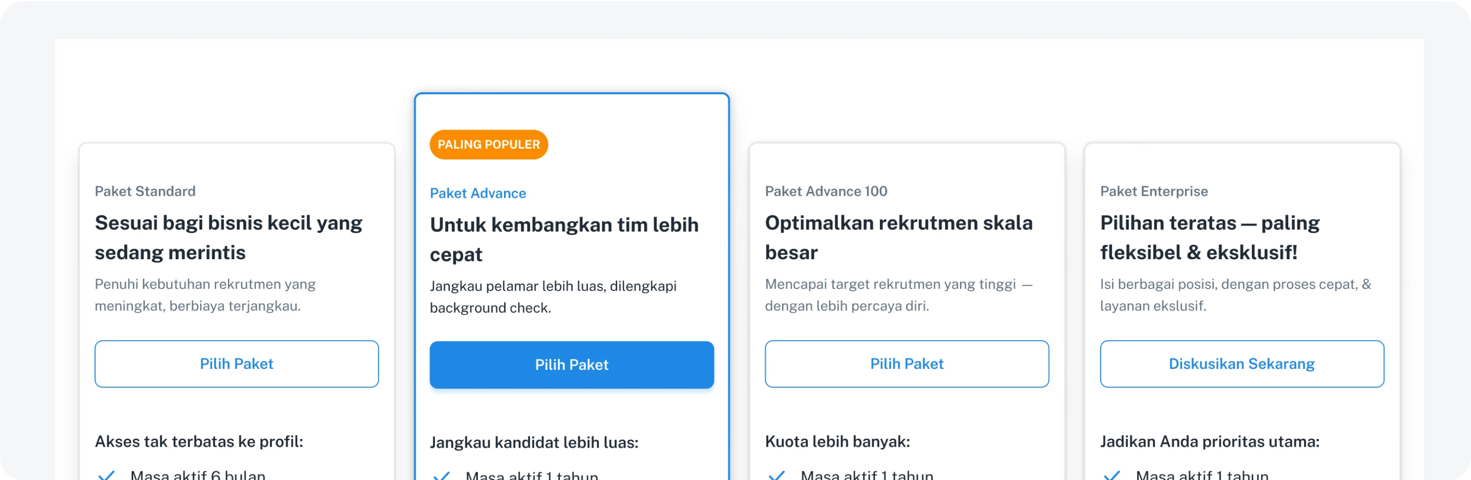
Lacks visual contrast on the main CTA
All buttons look similar — “Choose Package” and “Contact Sales” have the same visual weight, making it difficult for users to know which action is recommended.
Problem #3
There are no social proof elements
There are no testimonials, user numbers, or trust signals to build credibility.
How-Might We
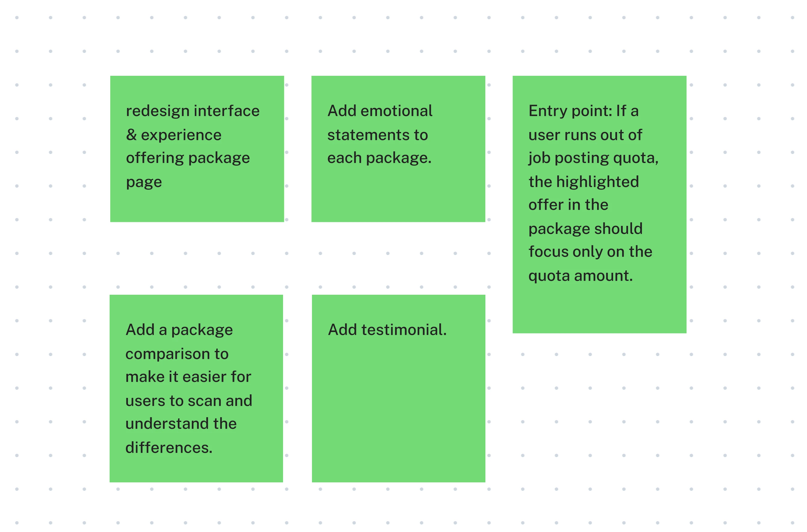
Brainstorming & Solutions
We tried to have discussions and brainstorm several solutions.
Final Design
Design Decisions
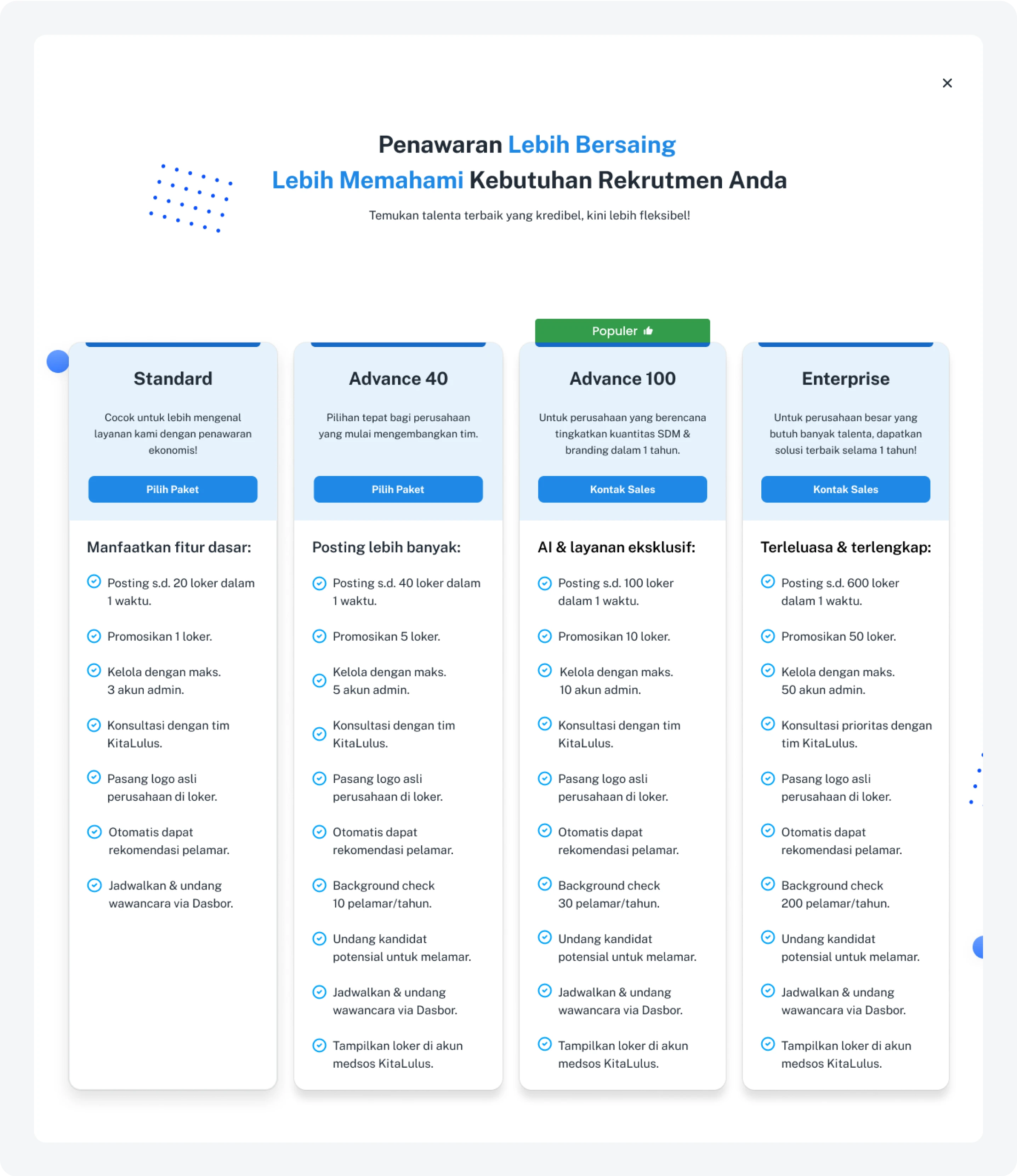
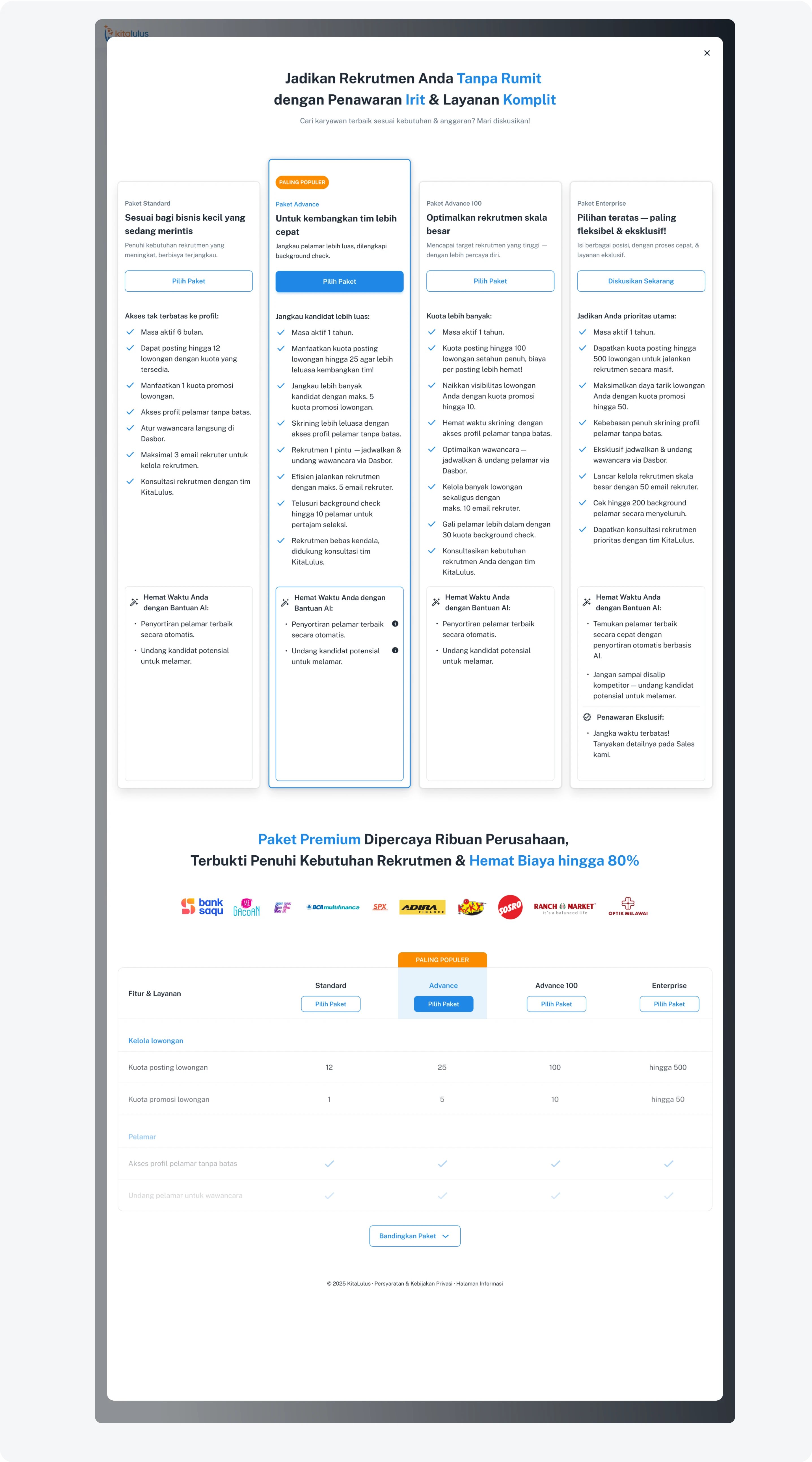
1. Redesign the visual design and user experience
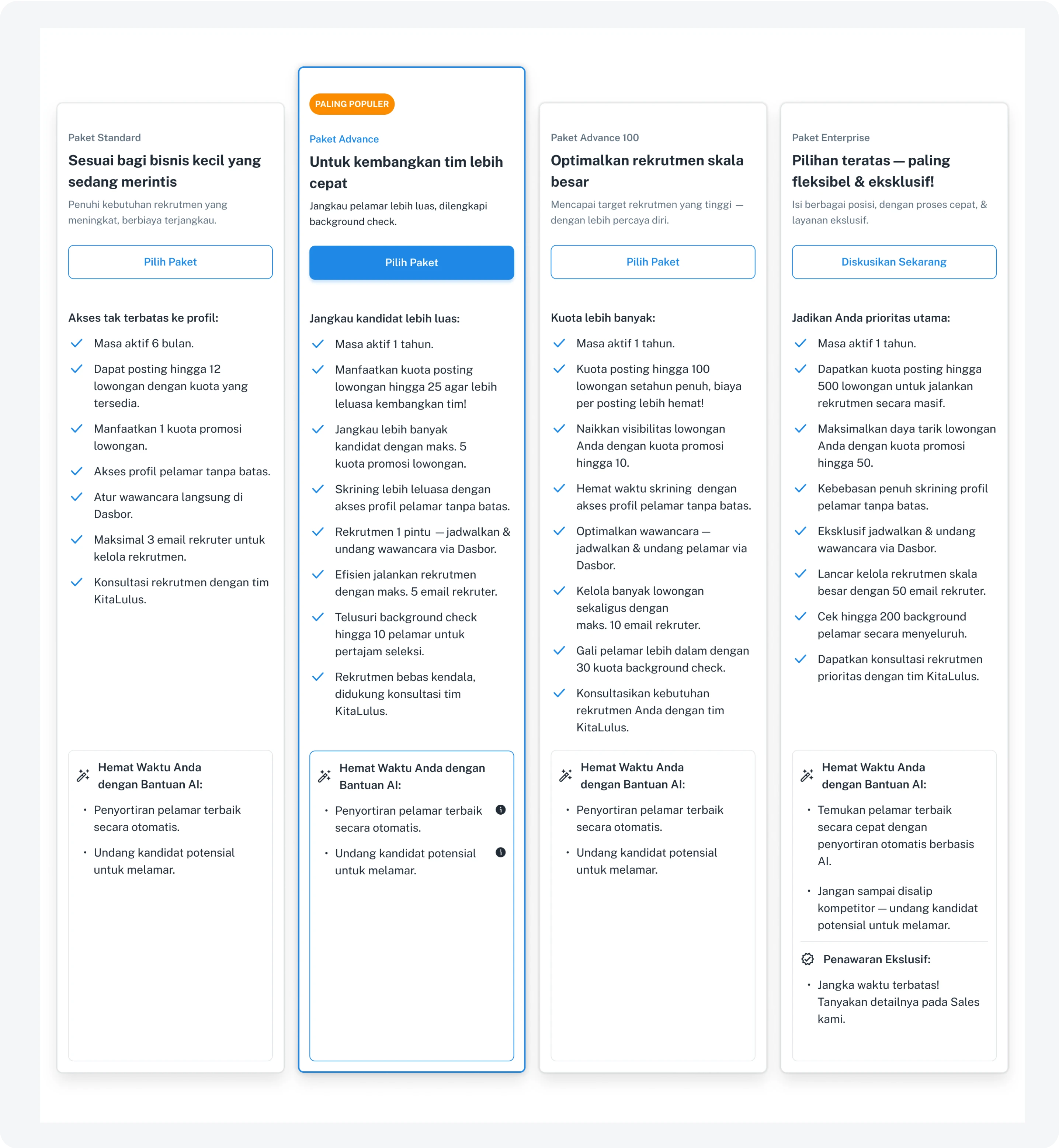
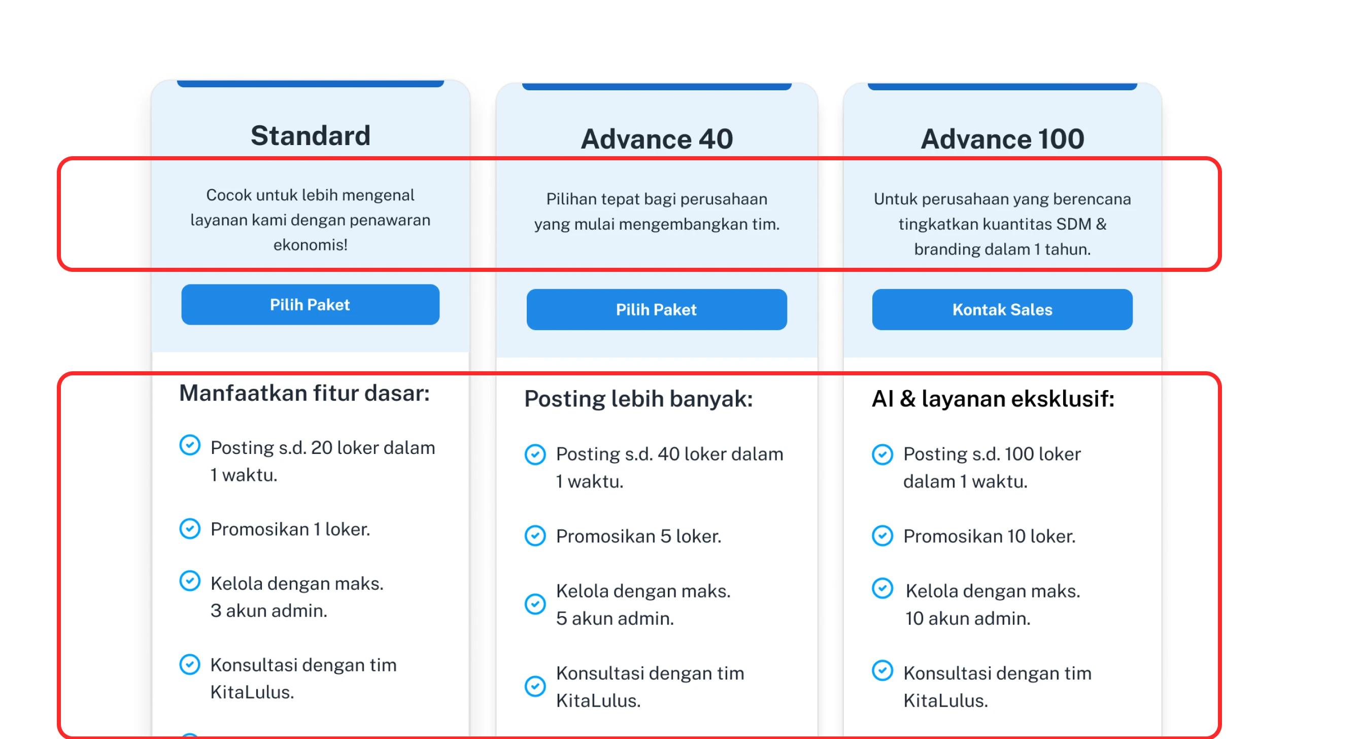
Creating a visual hierarchy makes it easier to identify the recommended package, prioritize CTAs, and clearly read the package features.
2. Emotional Statement
Package descriptions should align with company scale and user needs, using a tone that emphasizes the user’s emotions.
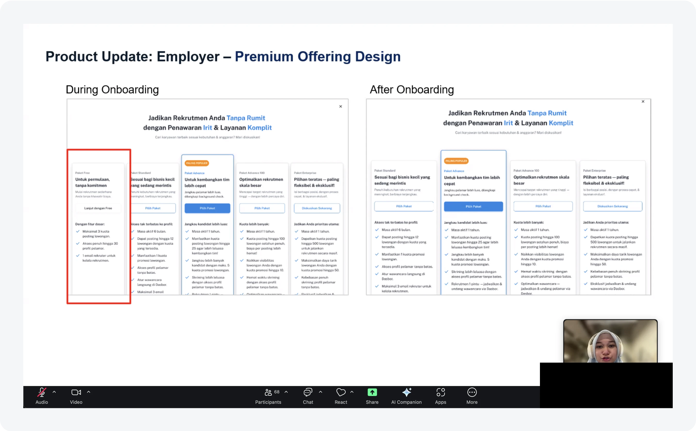
3. Entry Point
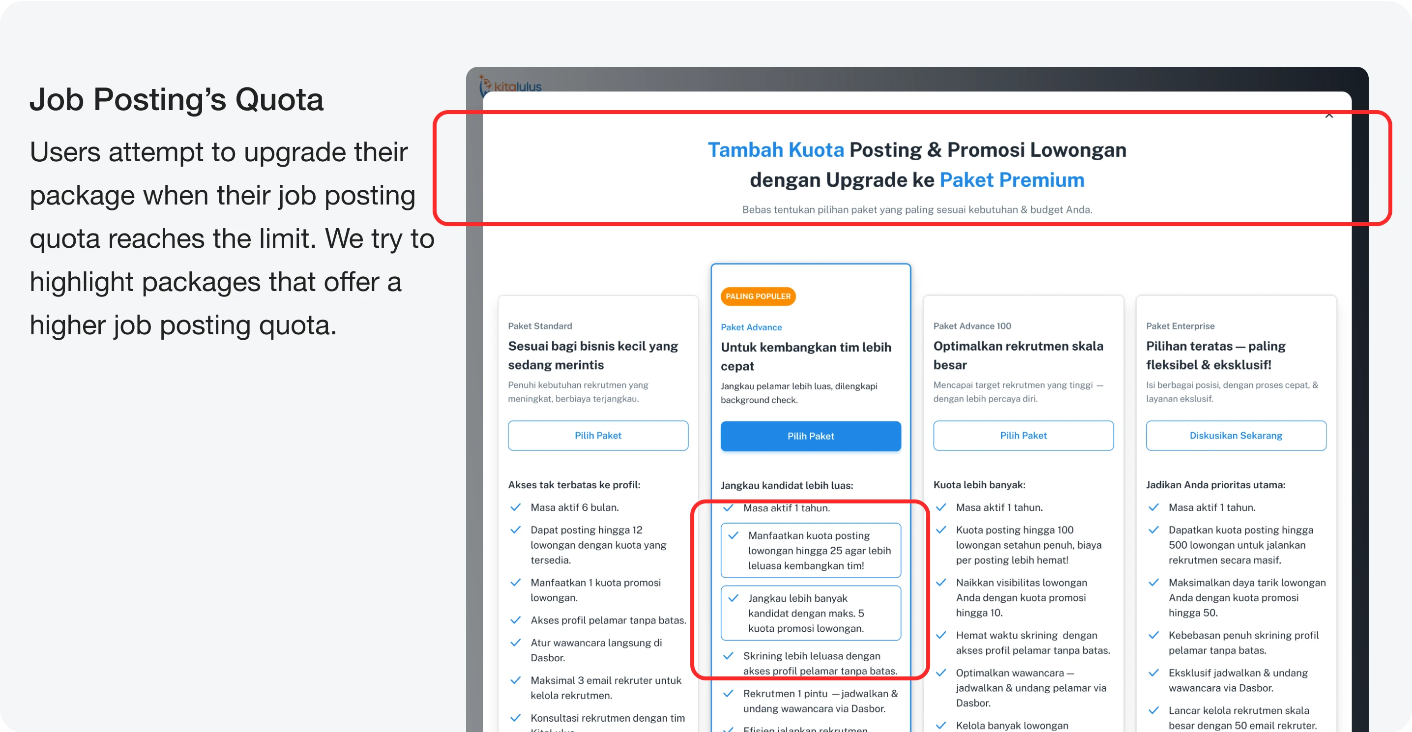
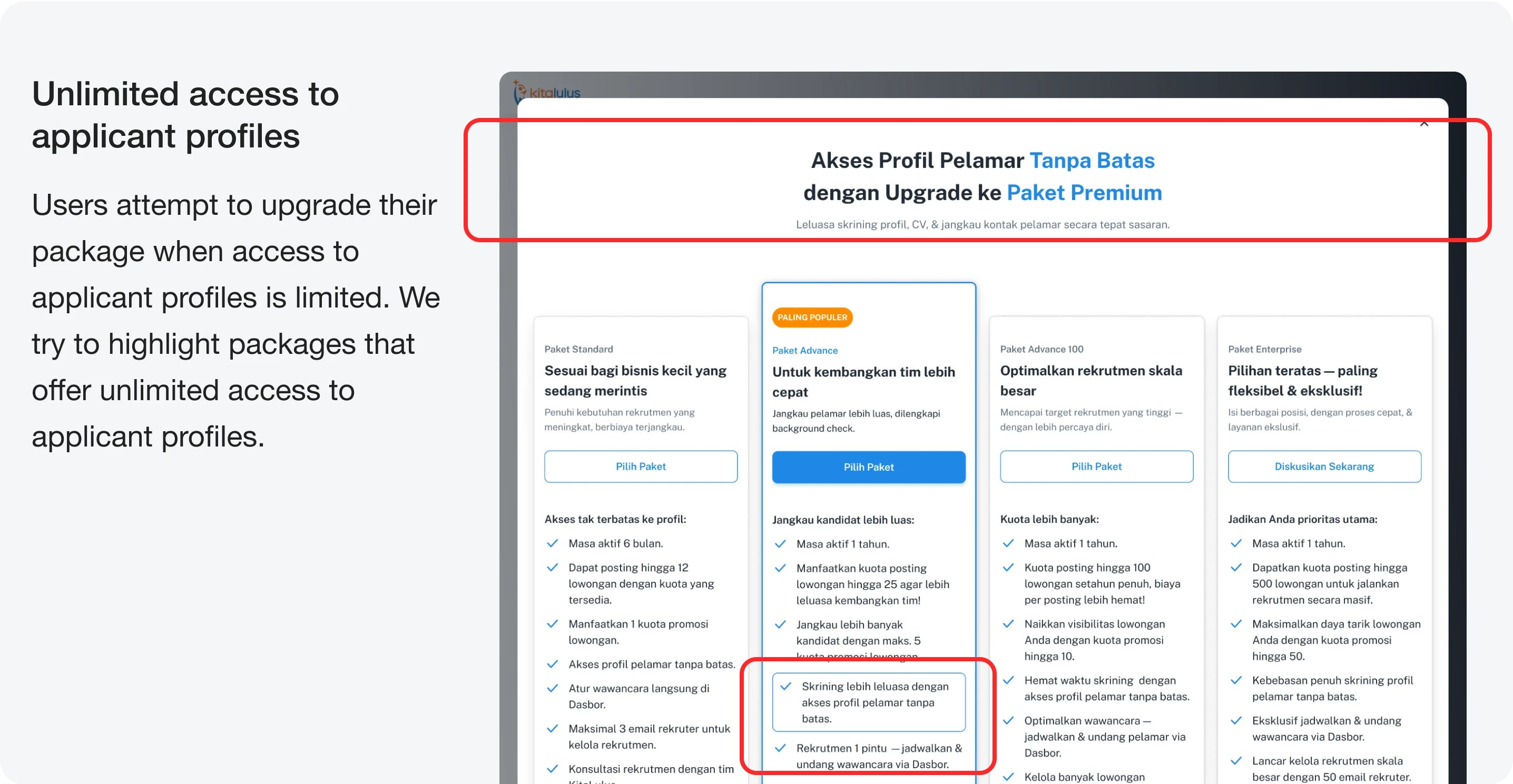
4. Add Package Comparison
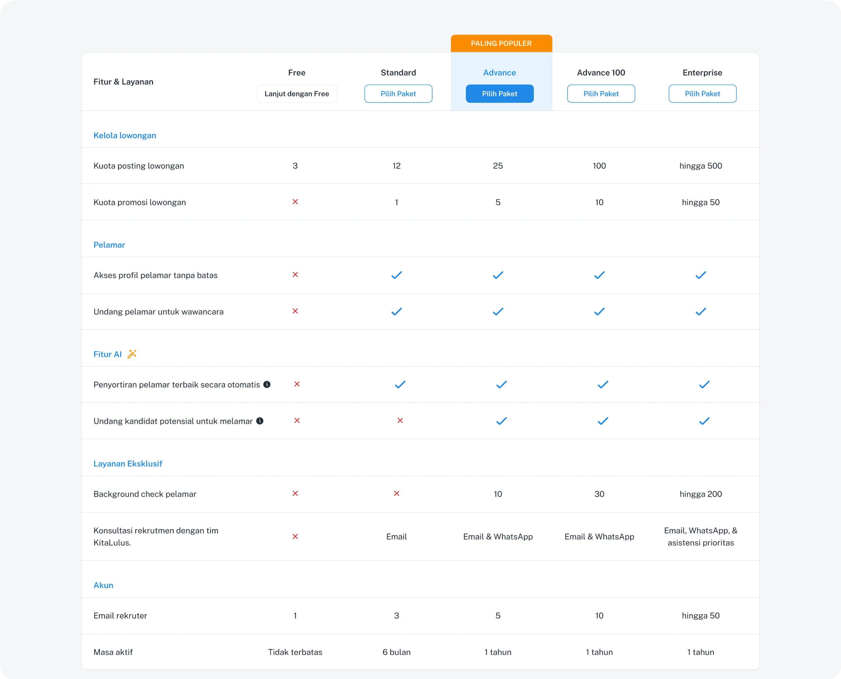
To help users quickly scan the numbers and availability of features in each package.
5. Add Package Comparison
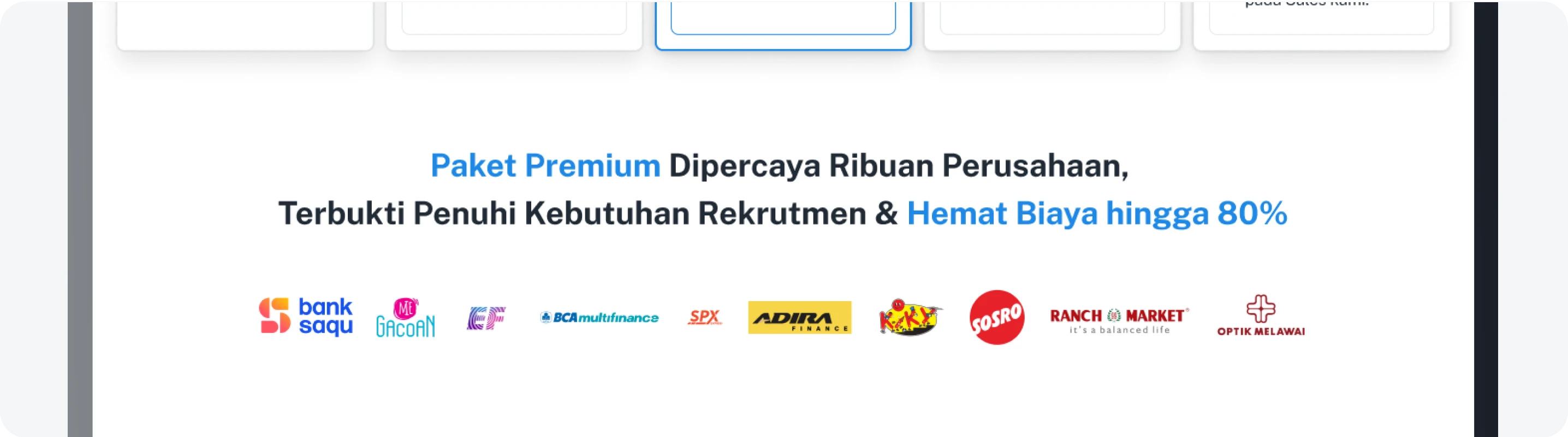
Testimonials help build user trust. Social proof — people are more likely to trust decisions that others have already made.
Final Design
Validation & Testing
Getting Feedback
We sought feedback from the Business team and clients to validate the ease of accessing information and readability.
Reflection
What I've Learnt & Special Thanks
I learned to better understand user behavior and how emotions influence their decision when choosing a package.
This project helped me recognize the psychological aspects behind user motivation and how design can guide their decision-making process.
I gained valuable insights into how the business team positions and sells products effectively.
I learned how to collaborate more closely with cross-functional teams to align user needs with business goals.
This experience strengthened my ability to balance empathy, data, and business perspective in design decisions.
Special thanks to:
Product Design Team: Tasya, Fariz, Amnesti
Product Team: Rusy, Geva
Business Team
Tech Team
and everyone involved in making this project possible.